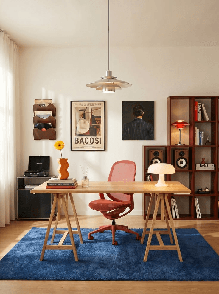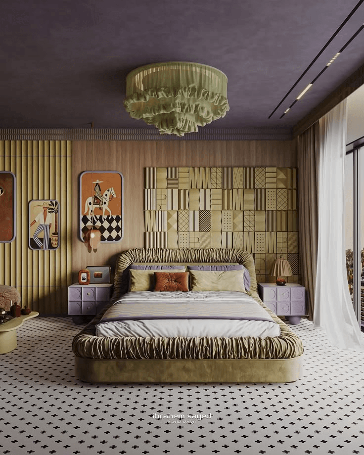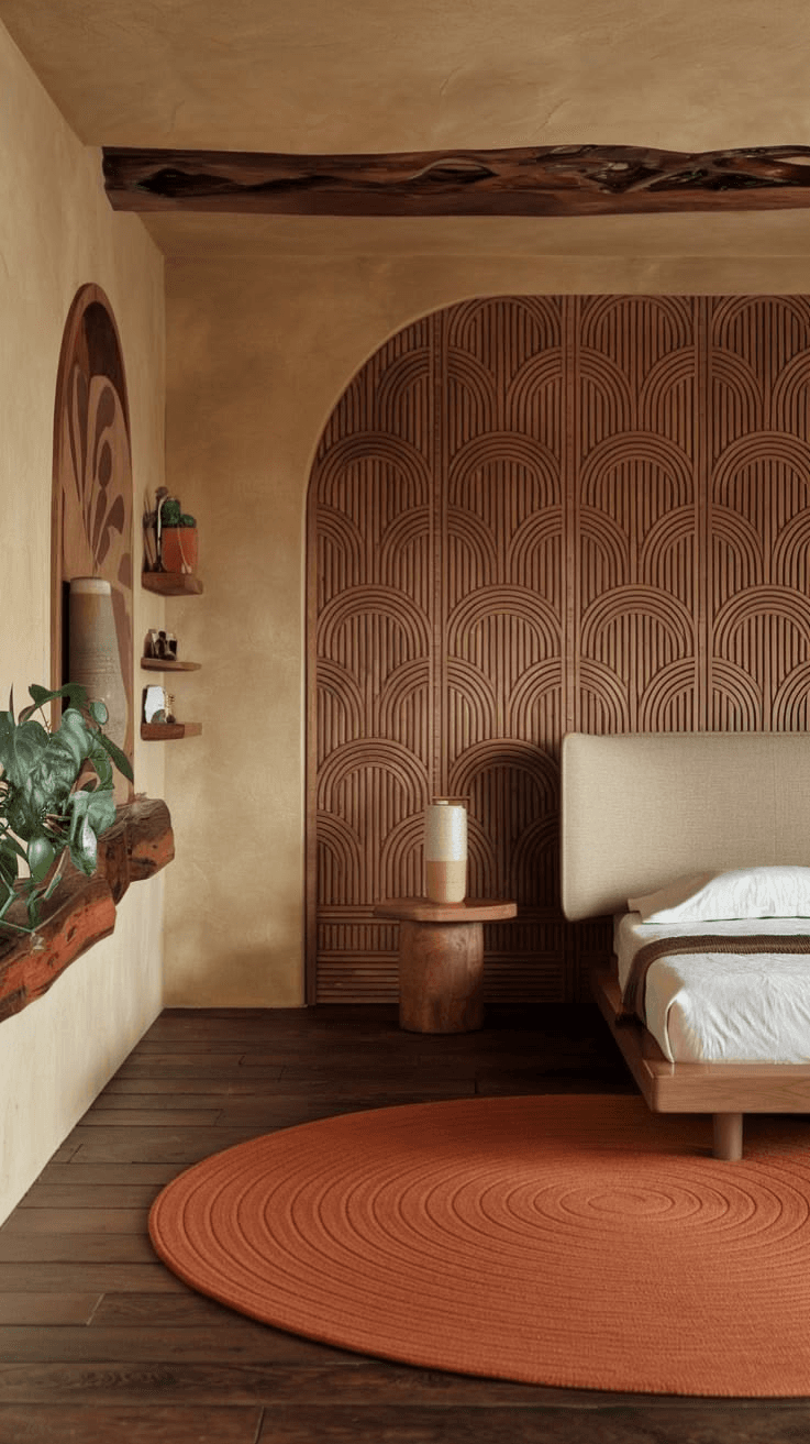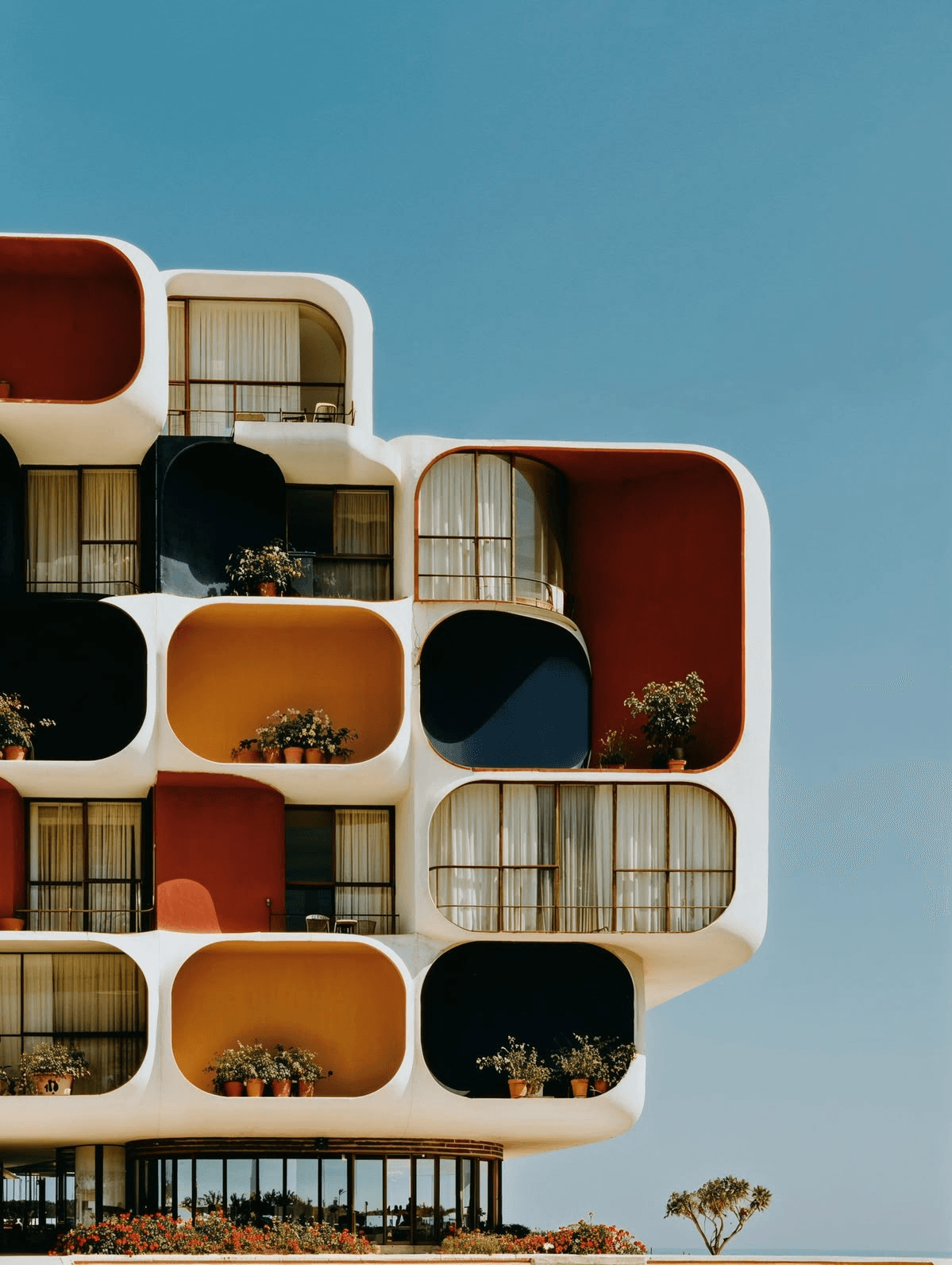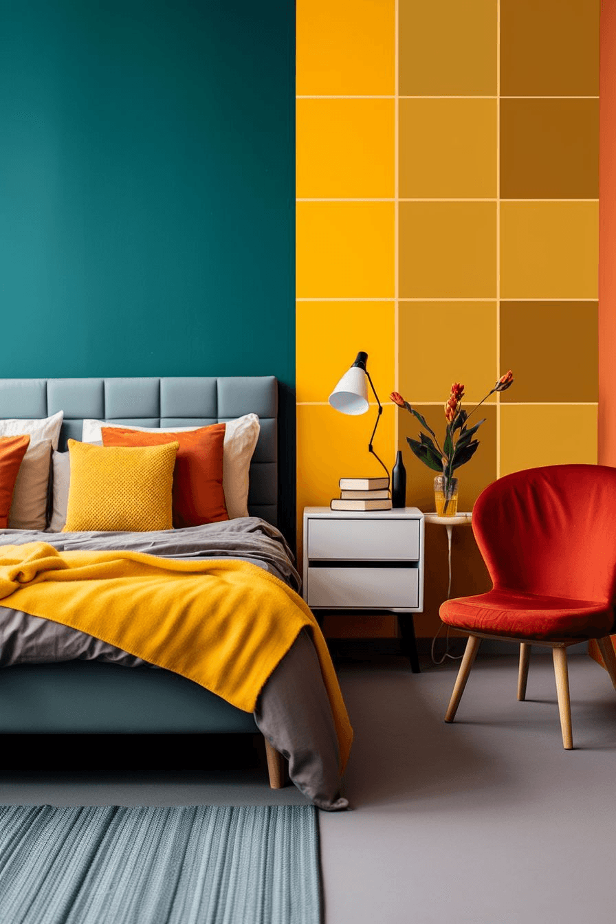
Understanding the Colour Palette
A colour palette is a carefully selected combination of colours used throughout a space to establish consistency and visual balance. Rather than choosing colours randomly, designers develop palettes that complement architectural features, furniture, finishes, and lighting conditions.
1. Primary Colour
This is the dominant colour that forms the foundation of the design. It often appears on walls, large furniture pieces, or flooring.
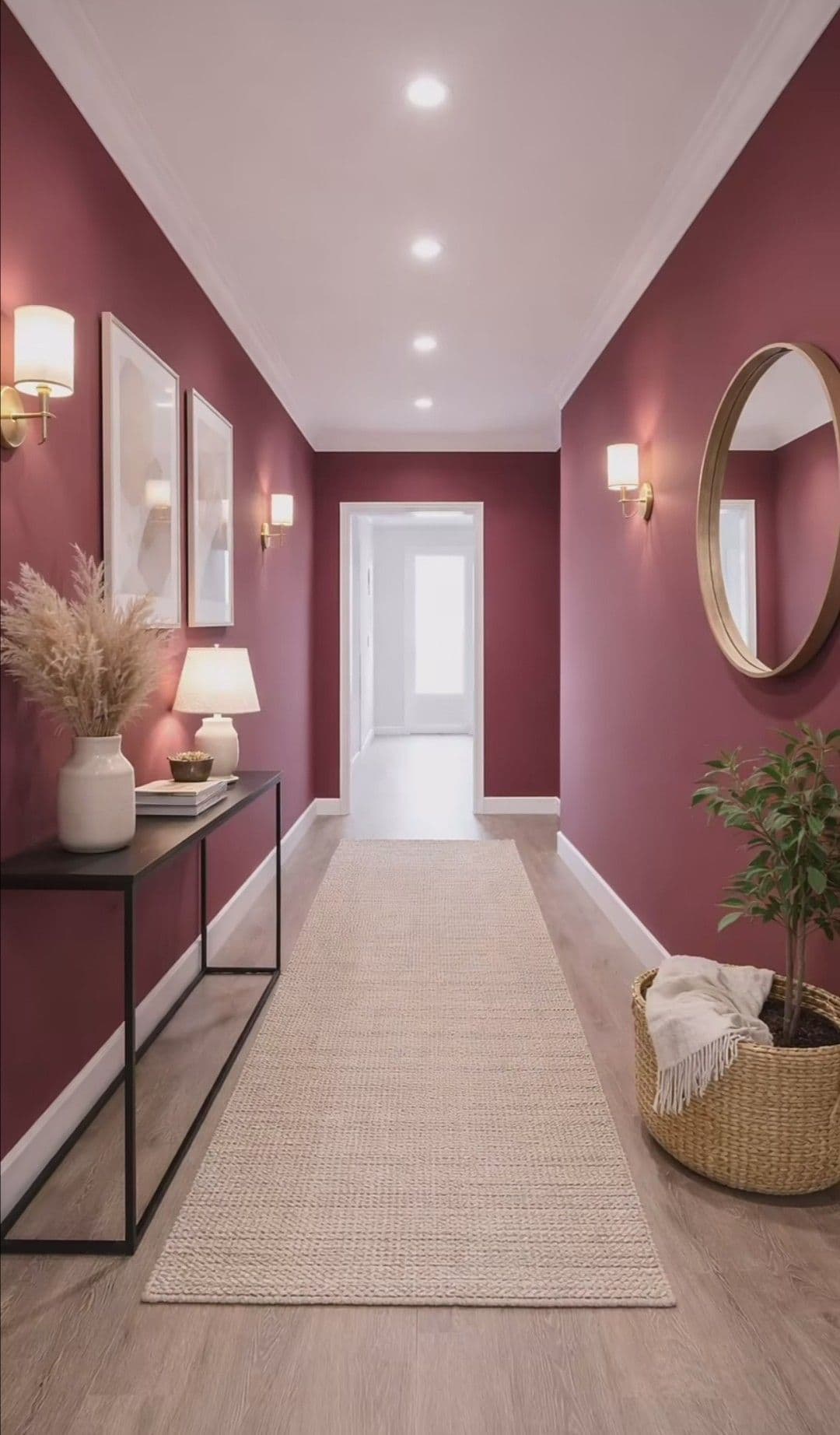
2. Secondary Colour
The supporting colour adds variety and depth while complementing the primary tone.
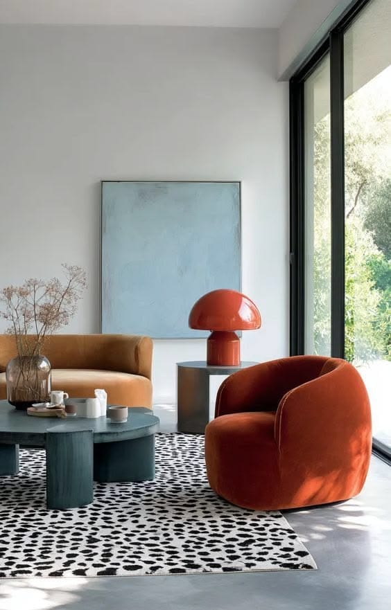
3. Accent Colour
Accent colours create visual interest through accessories, artwork, cushions, feature walls, or decorative elements.
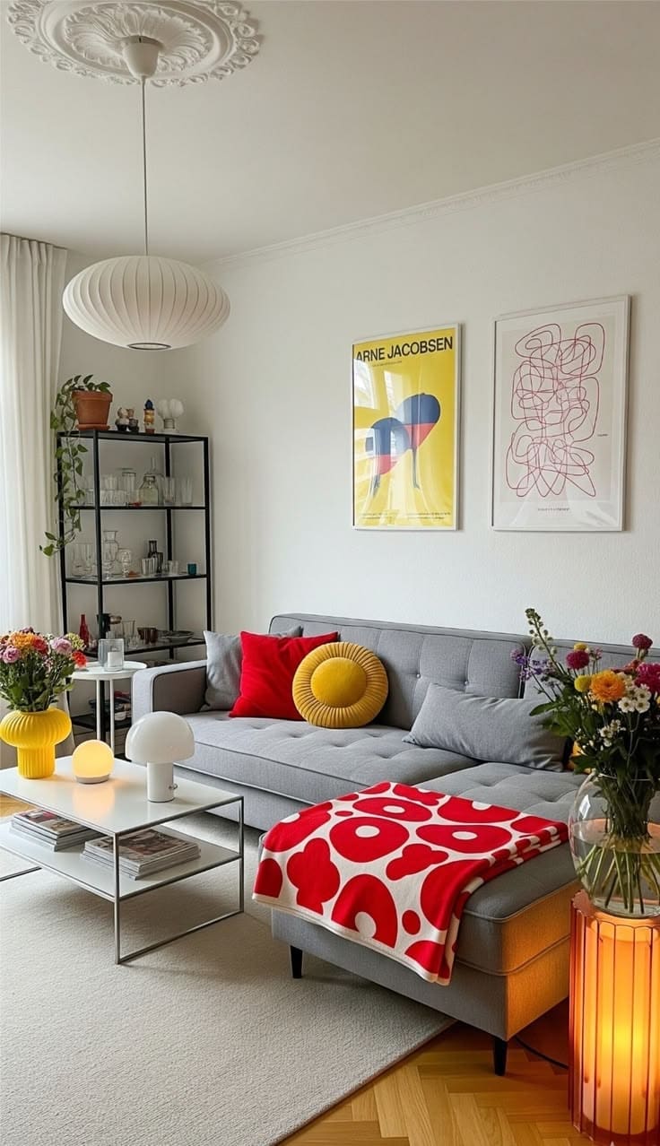
Popular Interior Colour Palette Trends
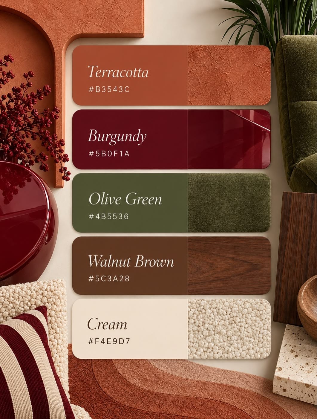
Warm Earth Tones
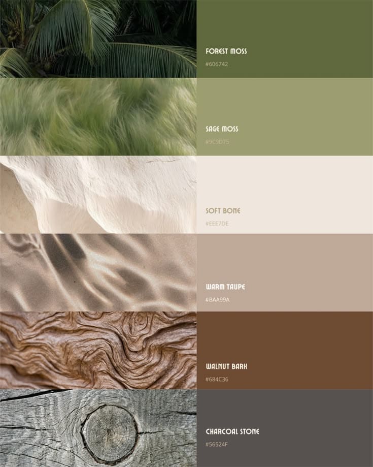
Inspired by nature, earthy palettes feature shades such as terracotta, clay, sand, olive green, and warm beige. These colours create comfortable, grounding interiors that feel timeless and welcoming.
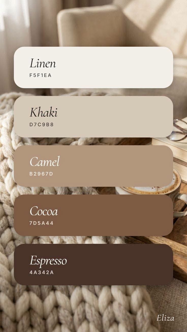
Soft Neutrals
Creams, taupes, greys, and off-whites remain a favourite choice for contemporary interiors. Neutral palettes provide flexibility while allowing furniture and décor to take centre stage.
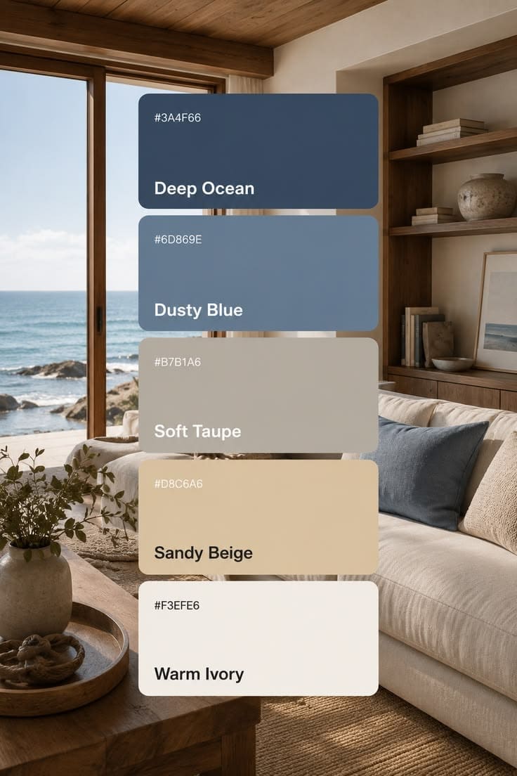
Coastal-Inspired Colours
Soft blues, whites, and sandy tones evoke a fresh and airy atmosphere. These palettes are particularly popular in homes where relaxation and openness are priorities.
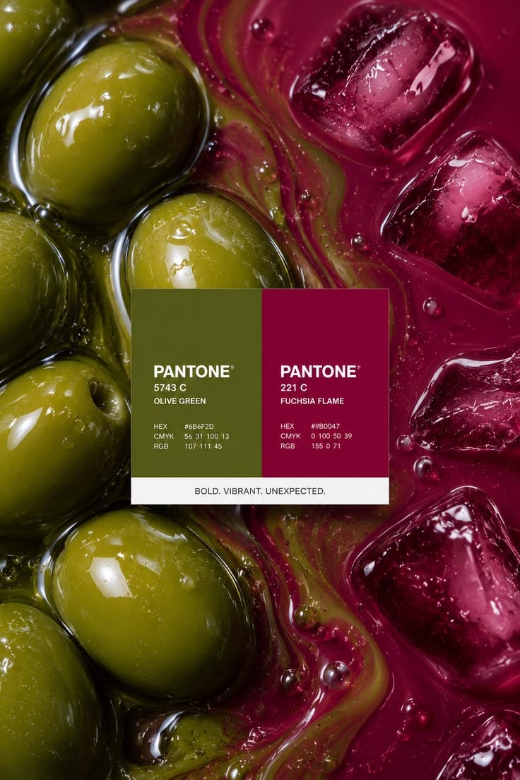
Bold and Moody Tones
Deep charcoals, forest greens, rich navy blues, and dark burgundies add sophistication and drama. When balanced correctly, darker palettes can create luxurious and intimate environments.
Nature-Inspired Greens
Green continues to be one of the most versatile colours in interior design. From sage and olive to deep emerald, green promotes balance, wellness, and a connection to the outdoors.
Factors to Consider When Selecting a Colour Palette
Natural Light
Lighting significantly affects how colours appear throughout the day. Rooms with abundant natural light can accommodate darker shades, while spaces with limited sunlight may benefit from lighter and brighter tones.
Room Function
Different spaces require different emotional responses.
Bedrooms often benefit from calming colours.
Living rooms can support warmer social tones.
Home offices may use colours that enhance focus and productivity.
Dining rooms can incorporate richer shades that encourage warmth and conversation.
Architectural Features
The existing architectural style should influence colour choices. Modern interiors often embrace clean monochromatic schemes, while traditional spaces may support richer and more layered palettes.
Personal Style
While design trends offer inspiration, the best colour palette is one that reflects the personality and lifestyle of the people using the space.
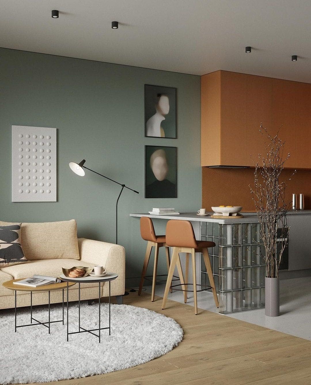
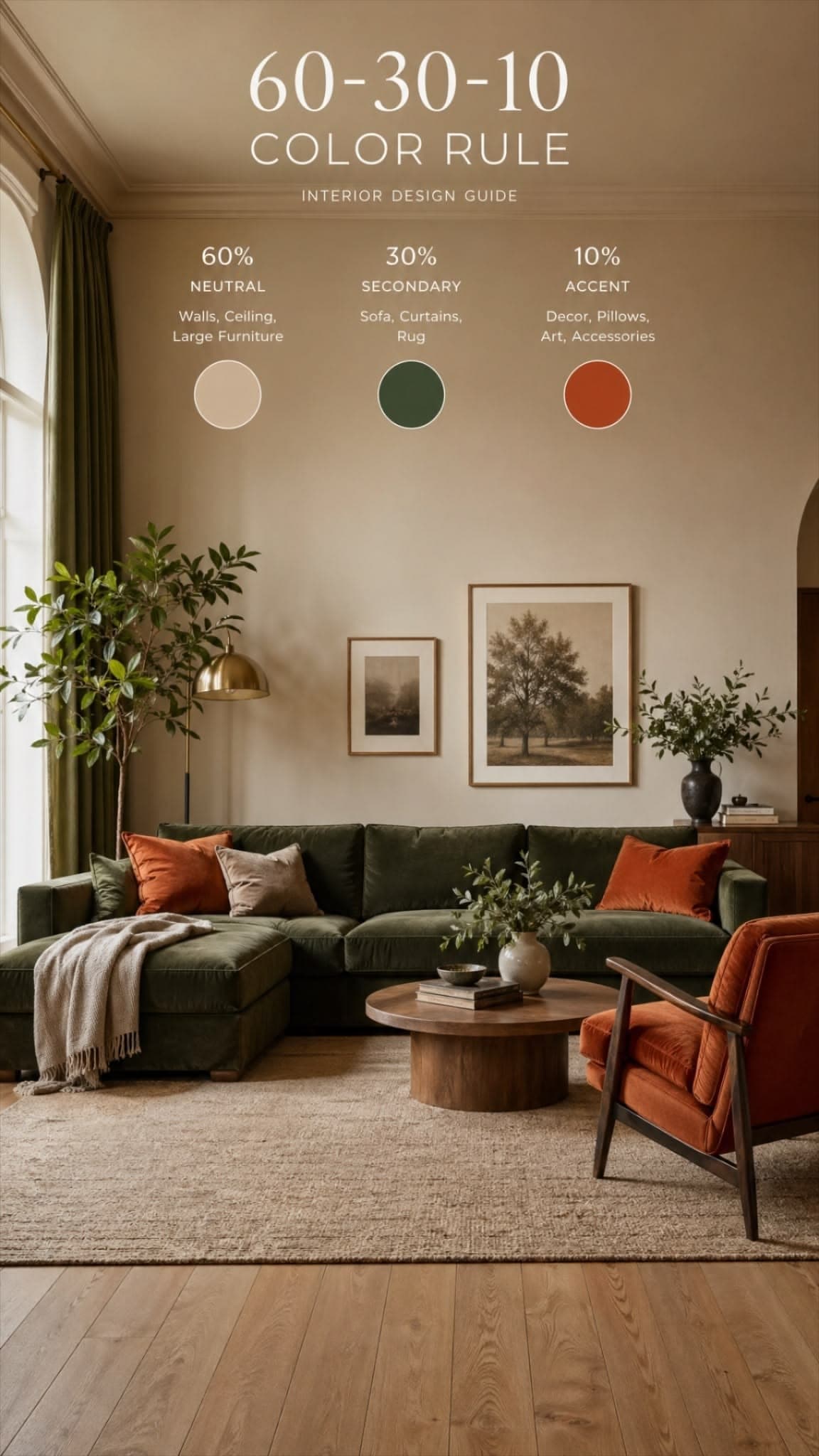
The 60-30-10 Rule
60% dominant colour (walls and larger surfaces)
30% secondary colour (furniture and textiles)
10% accent colour (decorative accessories and artwork)
Creating Flow Throughout the Home
A well-designed colour palette should extend beyond individual rooms. While each space can have its own personality, maintaining a consistent colour story throughout a home creates continuity and connection.
This does not mean every room must use the same colours. Instead, repeating key shades, materials, or undertones helps establish a cohesive design language that feels intentional and sophisticated.
Choosing the right colour palette is one of the most important decisions in interior design. It influences mood, enhances architectural features, and sets the overall tone of a space. Whether you prefer calming neutrals, earthy warmth, or bold statement colours, a carefully planned palette can transform any interior into a beautiful and functional environment.